The Project
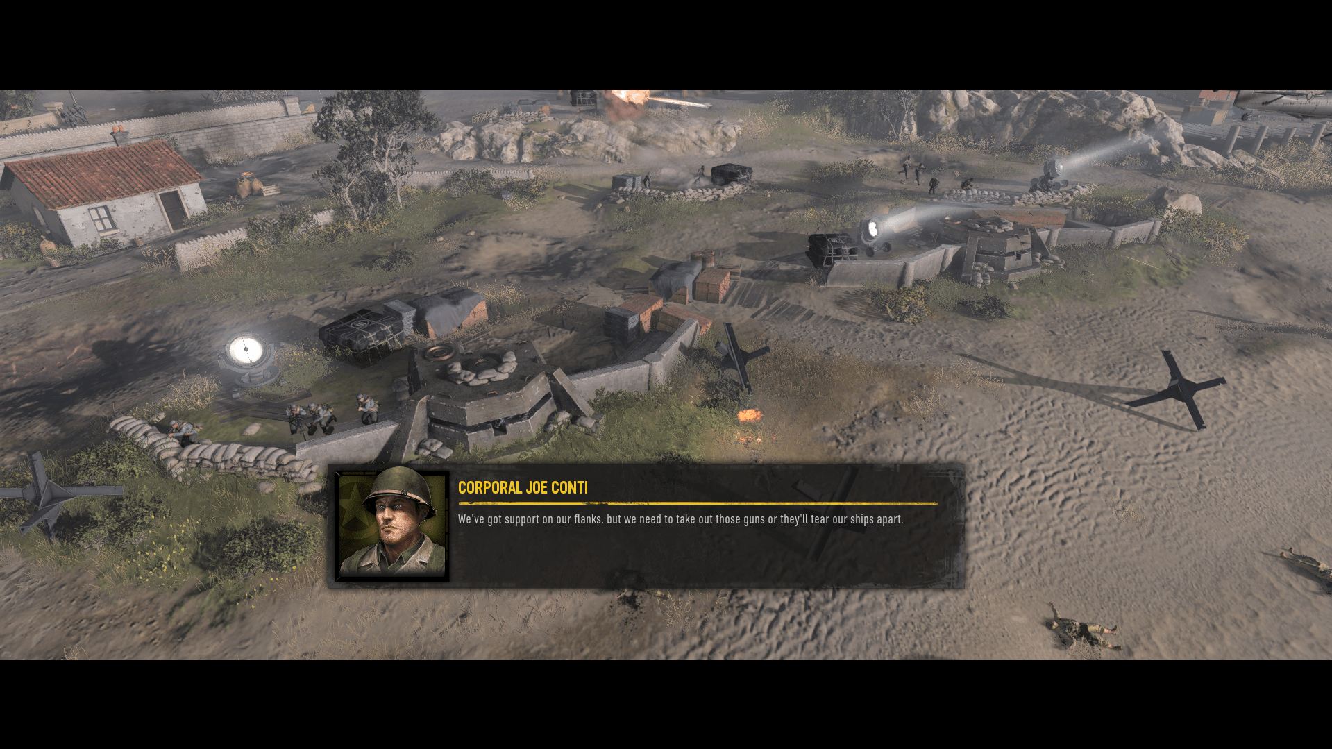
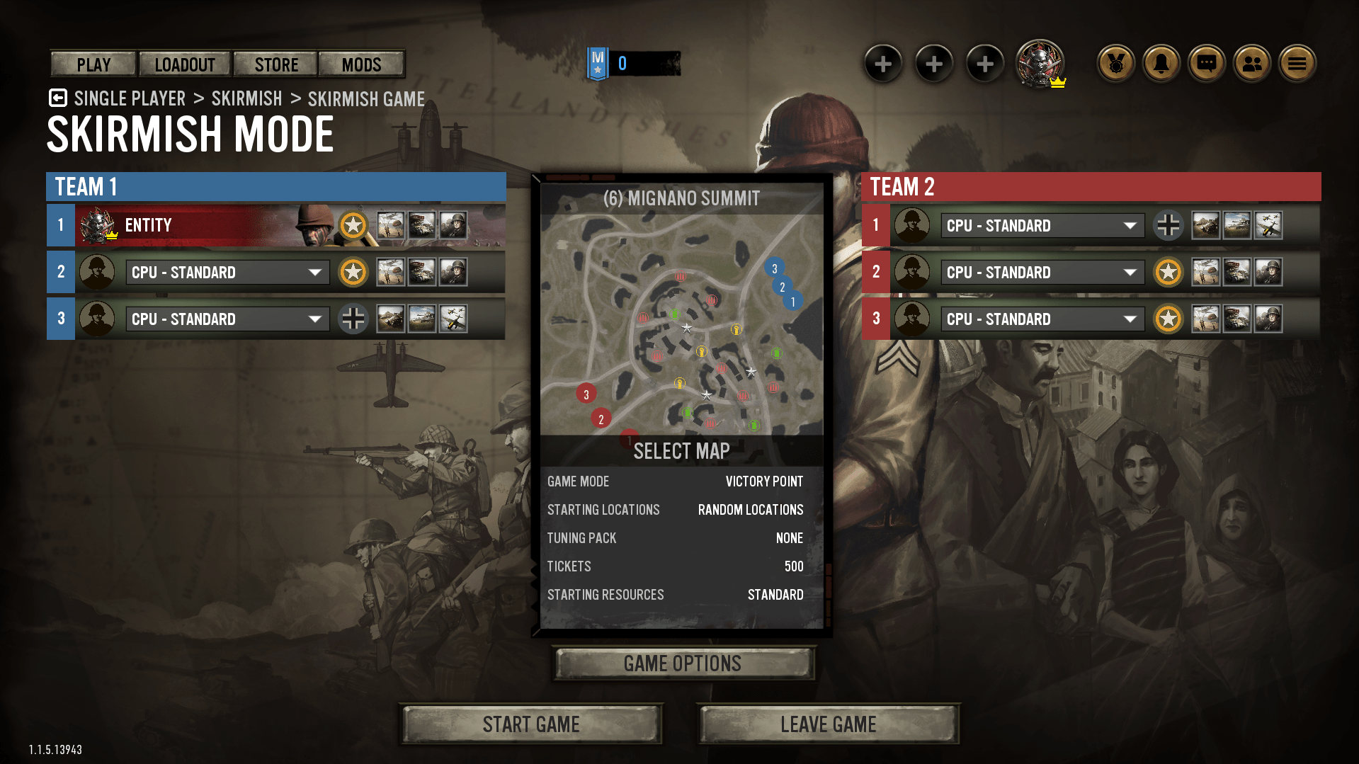
Company of Heroes 3 is a World War 2 themed RTS (Real-Time Strategy) developed by Relic Entertainment. The Company of Heroes franchise has historically been a PC only product, but with the release of Company of Heroes 3 has expanded to include Playstation and Xbox console releases. As a UX designer on Company of Heroes 3, I was responsible for the creation and quality of design deliverables across the product including: RTS gameplay, Turn Based gameplay on the newly introduced Campaign Map, and Front-end menus.
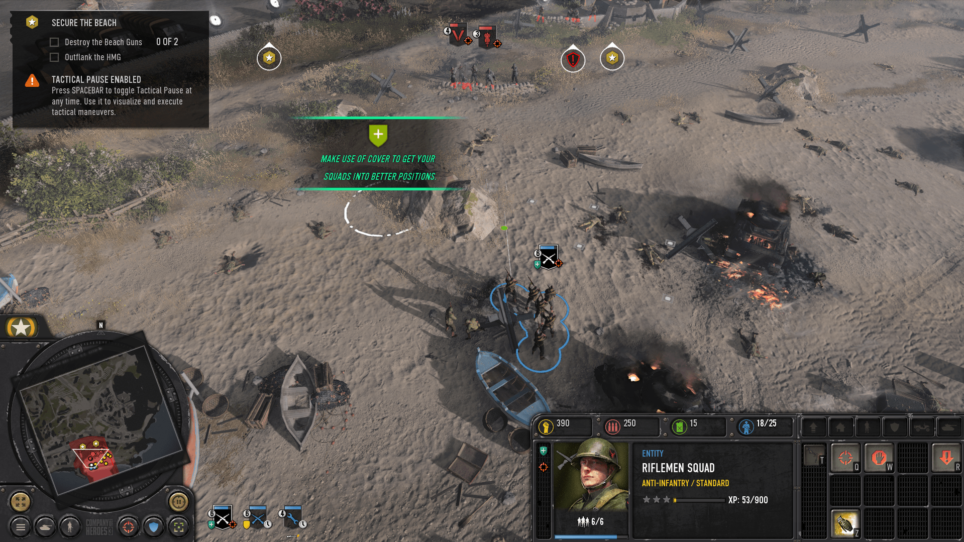
The design intent behind Company of Heroes was first and foremost to improve upon and modernize the success of Company of Heroes 2 which released in 2013. Additionally the vision for the project included expanding the expected feature set of an RTS title to make the game more approachable and accessible for new users. This initiative resulted in a the creation of newly introduced Tactical Pause and Campaign Map features, as well as expanded focus to the FTUE (First-Time-User-Experience) flow.
My Role
As a Senior UX designer, I was responsible for maintaining and advancing COH3's overall user experience. By joining Relic during the middle stages of COH3's development cycle, I took on the role of the primary UX owner for the product-wide UX. Additionally, as I was (at the time) the most senior UX designer on the COH3 team, I worked with the production and leadership teams to champion UX initiatives and improvements for both the MVP launch of COH3 as well as post-launch feature roadmaps.
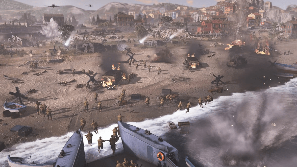
Working on COH3, I practiced end-to-end ownership of features, from concept to implementation. This process entailed several steps, including UX workshops, low/high-fidelity wireframing, interactive prototyping, and user-testing.
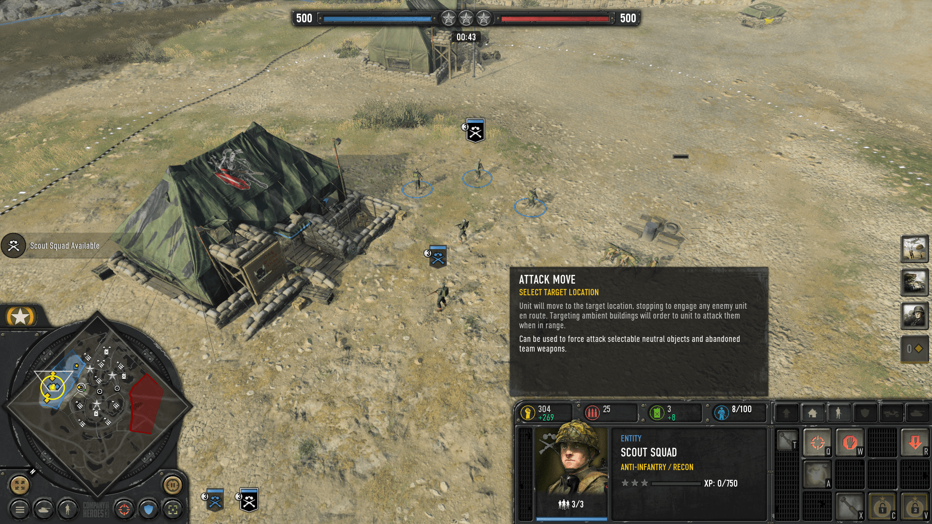
Over time, my role on the project expanded to include working directly with the senior leadership team in defining and documenting the post-launch feature roadmap for supporting COH3 in the years beyond launch as a live service product. As we received user-feedback (from internal user testing, and eventually from live user after launch day) I worked to advocate for Quality of Life usability improvements that heightened the overall COH experience. By taking full ownership of UX-based Change Requests, I was required to define and document all aspects of the design within a Creative Brief. The completed brief was then passed on to the relevant development team for implementation.
Design Focus: Tactical Pause
Likely the most ambitious feature in COH3 was the newly introduced Tactical Pause. This feature allows users playing in any single player game mode to "pause" the game at any time. While in this paused state the user can select any of their units or base buildings and queue up several input commands. Each unit and base building contained its own independent queue which allowed for the user to take their time setting up complex strategies at their own pace. While in Tactical Pause all queued commands were represented through responsive UI states to clearly communicate to the user what actions they have queued and in what order. Once the user exits Tactical Pause all units and buildings with queued commands will begin to execute them simultaneously.
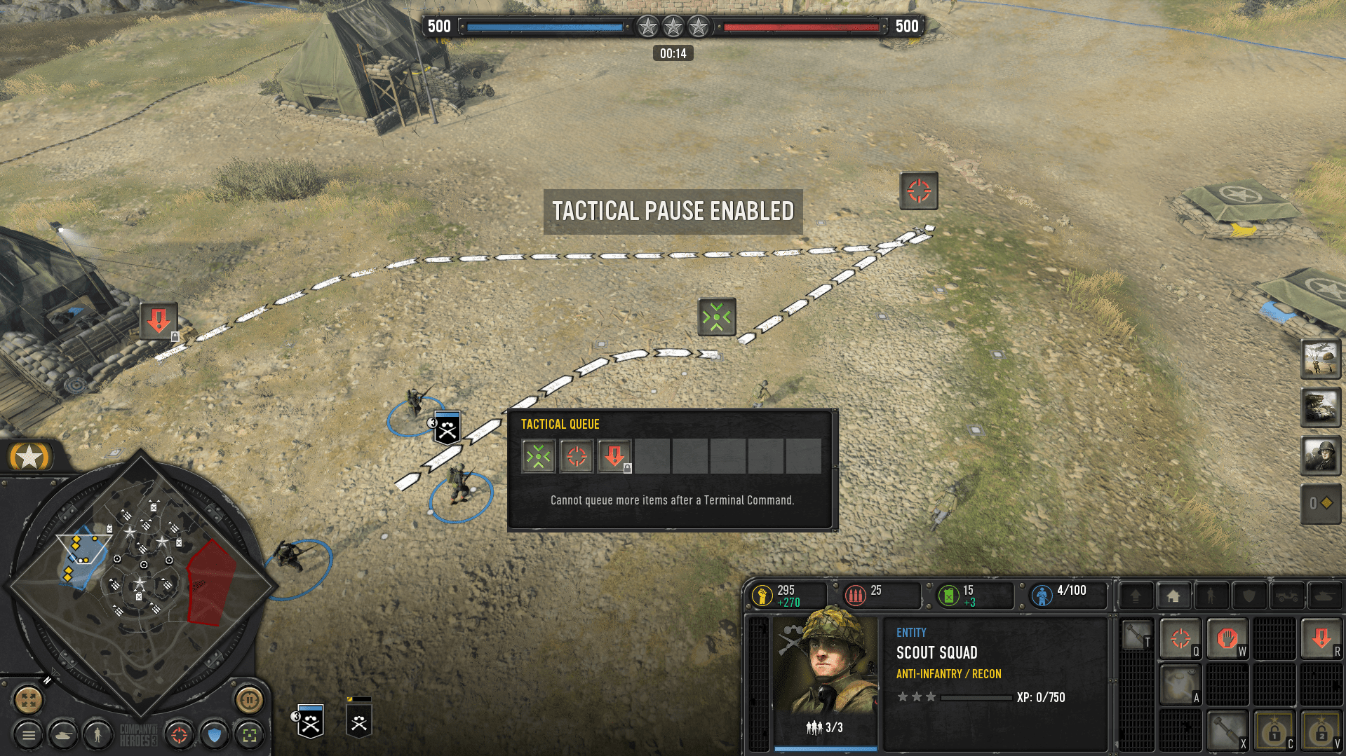
Tactical Pause proved to be an invaluable tool in making COH3 more accessible to users who, for whatever reason, struggled to keep up with the fast-paced action associated with RTS gameplay. The largest design challenge in creating the Tactical Pause feature was the sheer scale of it. We eventually realized that Tactical Pause was actually not a feature and instead a new design system underlying every feature in the RTS gameplay mode. Working in a small 4–5-member team we worked to run every feature available in RTS Gameplay through a Tactical Pause "filter" asking the questions: Does this work in Tactical Pause, does the feature change when used in Tactical Pause, are there edge cases created here, and if so, how do we address them? As a result, I am very proud to say the Tactical Pause feature has received very positive reviews from both critics as well as end users. My hope is that the feature can continue to grow and improve in future COH3 patches and releases.
Design Focus: Campaign Map
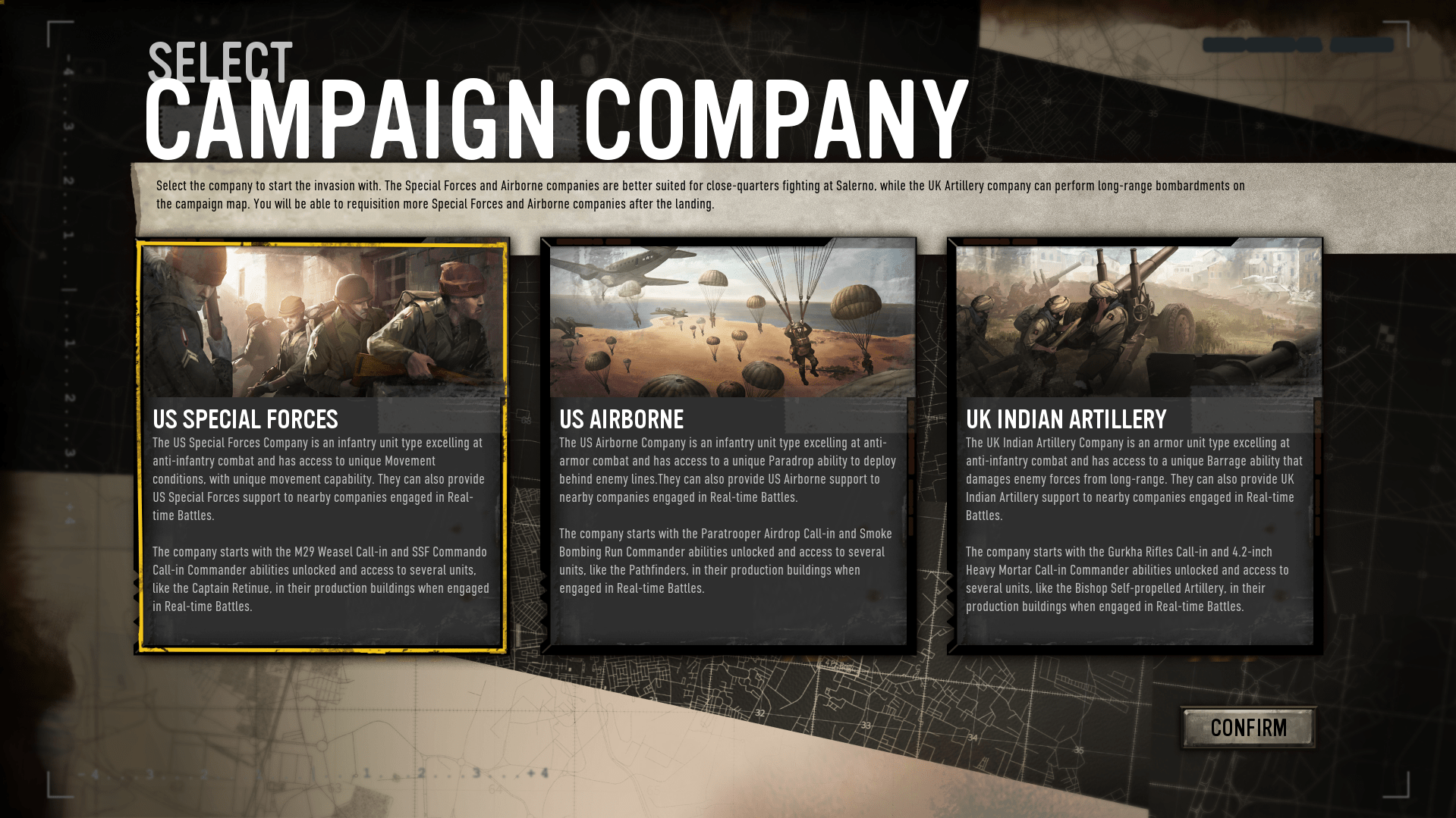
The other new feature introduced to make COH3 more accessible to new players is the Campaign Map portion of the Italy single player campaign. This Metamap layer allows players to engage with Total War style turn based strategy gameplay as a means of accessing the main RTS gameplay campaign missions. The vision behind this mode was to allow players to engage in higher level grand strategy gameplay where decisions and actions made on the Campaign Map would affect the gameplay within the lower level RTS missions. This allows for a higher degree of replayability of the Italy campaign mode as a user to replay the campaign making different Campaign Map level decisions and resulting in a notably different story progression and outcome.
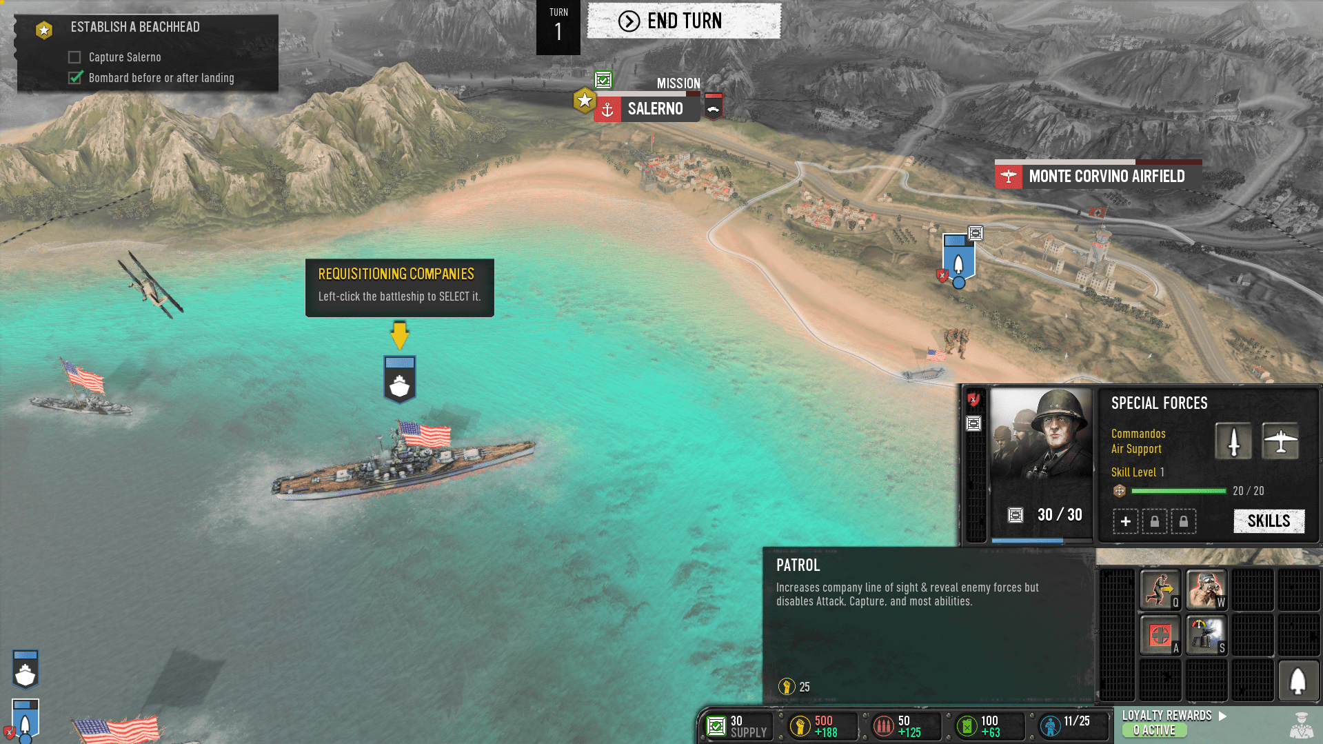
The design challenge for the Campaign Map was the sheer size of the scope for the feature. In creating essentially a Turn Based strategy game overlaying on top of the base RTS game the design and UX/UI teams were tasked with creating two different experiences that tied together correctly as a single product. Acting as a communication bridge between the RTS and Campaign Map game design teams I worked to maintain consistency of shared features between these modes and ensured that while both modes were satisfying stand-alone experiences, they worked together as one complete user experience.
Outcome
Ultimately COH3 has unfortunately struggled with mixed reviews on release and, like other titles such as Cyberpunk2077, is working to continue to make improvements as a live service product. Looking at the current launch state of the game I am very proud of what we accomplished in the first iteration of the Tactical Pause feature. I am also proud of the underlying UX design seen in the RTS, Campaign Map, and Front-End portions of the game which will ideally continue to improve as more polish work is applied in future patch releases.
